
Bring Your Lessons to Life
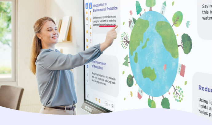
A digital whiteboarding solution that accommodates all teaching styles, empowering the creation of dynamic, multimedia-rich lessons.

A Tool for Every Educator
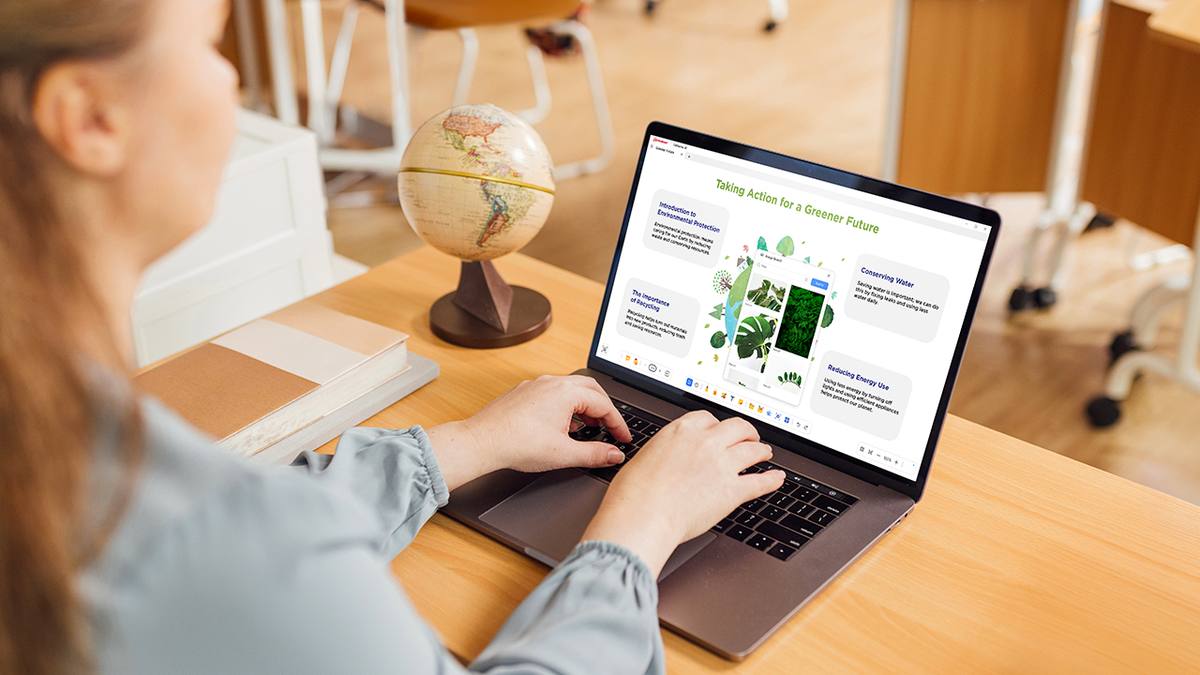
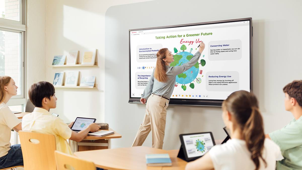
From lesson preparation to sharing materials after class, myViewBoard is versatile enough to accommodate any teaching style and ensure that every student’s learning needs are met.



ISTE Seal Certified
myViewBoard is ISTE Seal Certified, so you know it’s been tested for what really matters—usability, accessibility, and inclusivity. It’s a trusted sign that it supports effective teaching and is built to scale with the needs of today’s classrooms.
Made for Inclusive Teaching
Ensure every student can succeed with myViewBoard’s accessibility features. These tools empower differentiated instruction, enabling every student to participate equally, no matter their learning needs.
ViewSonic Educator Community
Join a Global Educator Community
Step into our vibrant ViewSonic Educator Community and connect with passionate, like-minded peers from around the world. Share resources, exchange best practices, inspire one another, and enjoy exclusive access to EdTech events that will enrich your teaching journey.
Join NowRecently upgraded—download the latest version below for even more teaching magic!
Seamless Whiteboarding Across Platforms
Enjoy the best in digital whiteboarding with myViewBoard today! Thanks to its cross-platform compatibility, you can easily transition between your favorite devices for an efficient workflow in and out of the classroom.
On Windows 10 or later? You’re good to go. Using a ViewBoard?
Check compatibility below—it’ll only take a sec.
Check ViewBoard Compatibility
Get to Know myViewBoard, One FAQ at a Time
New to myViewBoard? You’re in the right place. Explore the frequently asked questions below for quick, helpful answers to get you creating, teaching, and collaborating with confidence.
-
What is myViewBoard?
myViewBoard is a digital whiteboarding platform that helps teachers deliver engaging, interactive lessons. It works for both in-person and remote teaching, giving you tools to create classroom content, present, and collaborate with ease.
-
What devices can run myViewBoard?
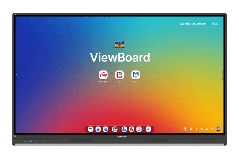
myViewBoard runs on most Windows, Android, and macOS devices, as well as major browsers. It’s also built into ViewSonic ViewBoard displays and Slot-in PCs for a smooth, ready-to-go experience—just check the ViewBoard compatibility list to make sure your device is supported.
-
Is myViewBoard easy to use?
Absolutely. With its clean, intuitive interface, it feels effortless from the moment you log in—and stays just as easy to use across Windows, Android, macOS, and web browsers.
-
What features does myViewBoard have to engage students?
myViewBoard is packed with tools to keep students engaged—from Pop Quiz and polls to Participate Mode, which gives each student their own canvas to interact with. Plus, with the built-in multimedia library, ViewSonic Originals, you’ve got everything you need to create captivating lessons with ease.
-
Why is myViewBoard better for teachers than other digital whiteboard tools?
Unlike general whiteboarding apps, myViewBoard is built for the classroom. With AI tools, accessibility features like Irlen Backgrounds, cloud drive integration, and broad file support, it’s all about making teaching easier, quicker, and more inclusive.
-
Is my data safe on myViewBoard?
Yes! myViewBoard safeguards student privacy by securely storing data within your geographic region, keeping it safe and close to home. We’re also fully GDPR-compliant, so you can count on strong, reliable protection every step of the way. And when it comes to file storage, you're always in control—whether that’s saving files locally or using your preferred cloud service like Google Drive, OneDrive, Dropbox, or Box.
-
Can I import my lesson materials to myViewBoard?
Yes! myViewBoard lets you upload and use your existing materials, including PowerPoint presentations, PDFs, and Google Slides, so you don’t need to recreate your lessons from scratch.
-
Where can I find help with myViewBoard?
The myViewBoard Knowledge Base is full of easy-to-follow tutorials and guides to walk you through anything you need. And if you ever get stuck, our support team is just a message away, ready to help.


